Streamlining communication between clients and customers
Integrating a communication feature within Under's native financial services software application.
TEAM: Brett Benson, Noor-e-Jehan Umar, Andrew Chanlehka, Bai Hengyi, and Beeya Kim
ROLE: Product Designer
DURATION: 2 months
Problem
Communication between Under’s Clients and End Users was previously limited to communicating manually via email and phone calls. This is a problem because it takes the Under Client and the End User away from the application, slowing down the application process.
Outcome
I worked on a team of designers and built a Minimum Viable Product (MVP) of an internal messaging feature within the Under software application allowing Under Admins, Clients, and End Users to be able to communicate with ease.
Understanding the Problem
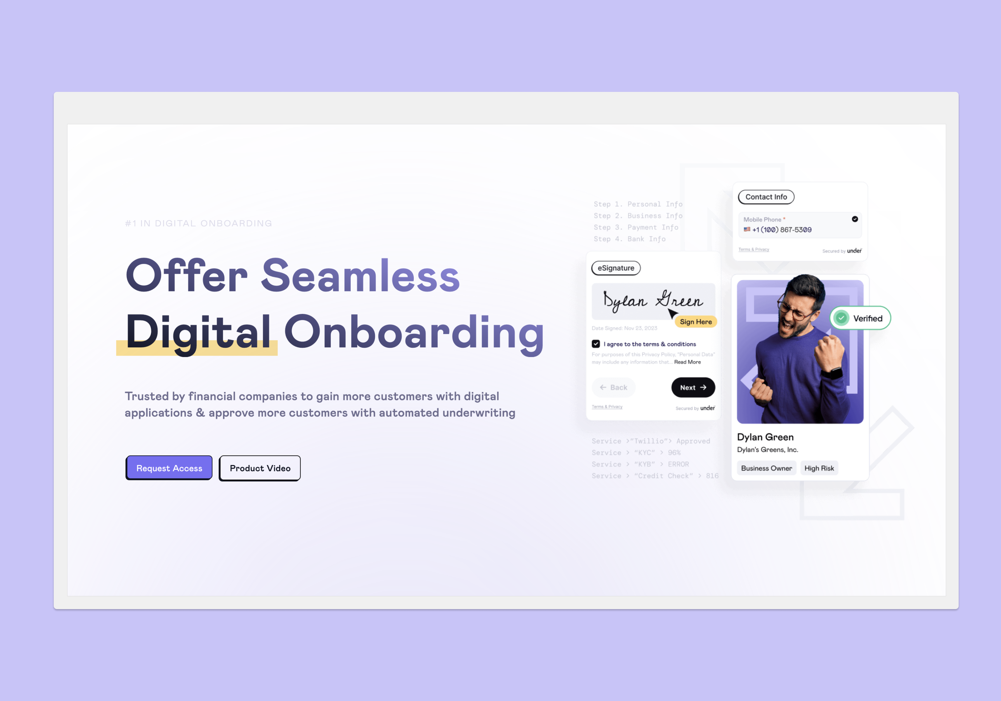
WHAT IS UNDER?
Under is a no-code software platform that helps financial services companies upgrade their onboarding capabilities.
With digital applications, identity management, and direct integrations.
Research
We interviewed 5 users & stakeholders in the company to understand the goals and challenges of the current system.
Business Goals
Improve the user experience of the application process by integrating a messaging feature within the Under software.
Client Goals
- Submit applications of potential leads → Approve submitted applications.
- Manage end-user data
End-User Goals
Quickly and easily fill out digital application forms and track application progress.
WHY IS THIS A PROBLEM?
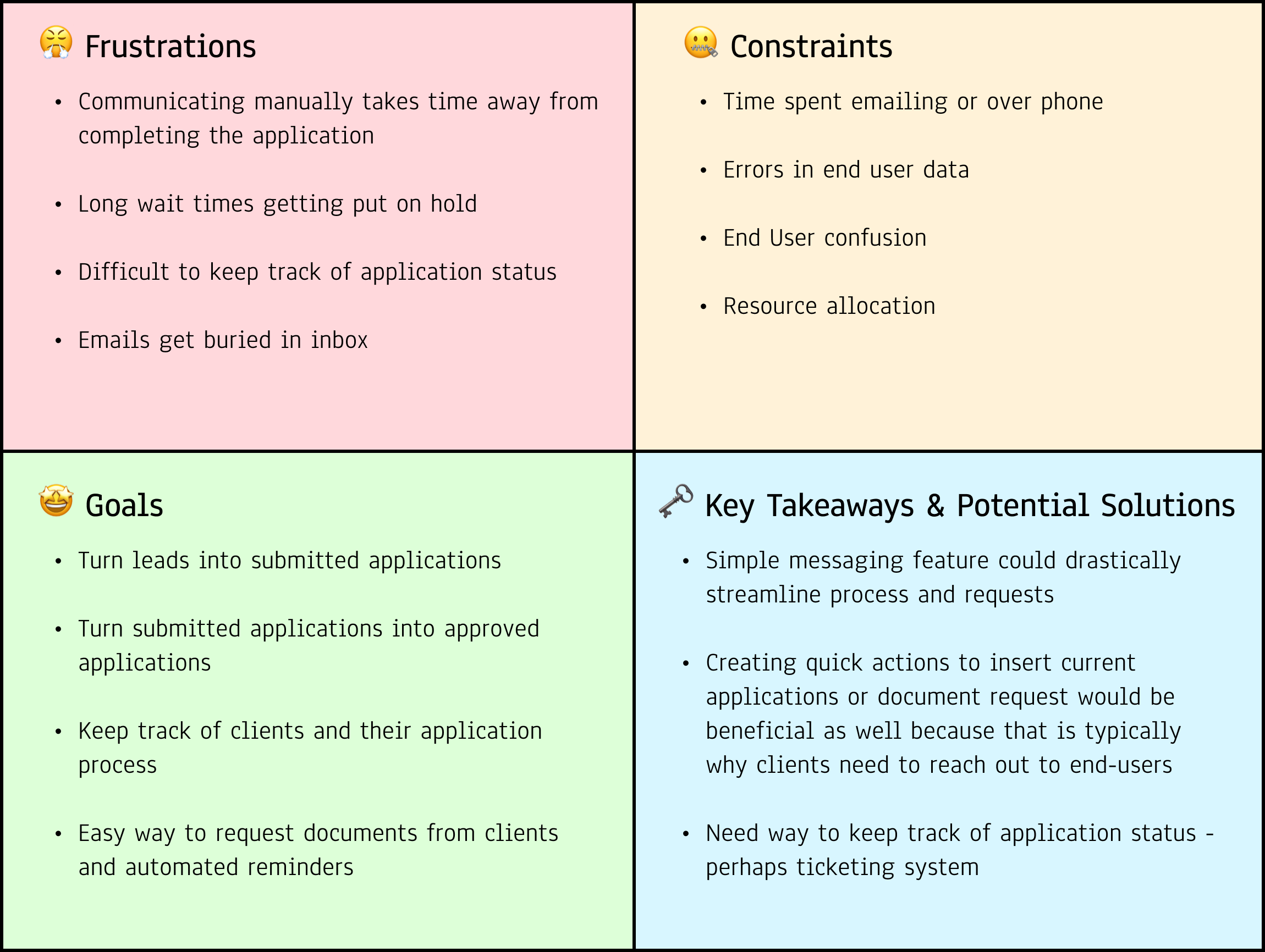
The current system is archaic - communication is limited to email or phone calls between Admins, Clients, and End-Users.
🚧 Obstacles
Clients face long wait times to receive help on call and emails get lost in inbox.
⚖️ Resource Allocation
Admin is managing multiple tasks; time spent on calls with Clients means time away from other important tasks.
🚫 Errors
Communicating via email & phone leads to errors with changes in End-User data or integration errors.
😵💫 Confusion
End-Users often are confused and have questions about why the Under-Client may need certain information.
Solution Goals
We distilled our findings into three key opportunity spaces to center our solutions around.
Improve communication between Admins, Under Clients, and their customers
Alleviate the workload of Under admins by making direct communication possible within the app
Improve the application process by making requesting documents from users and sending reminders easier.
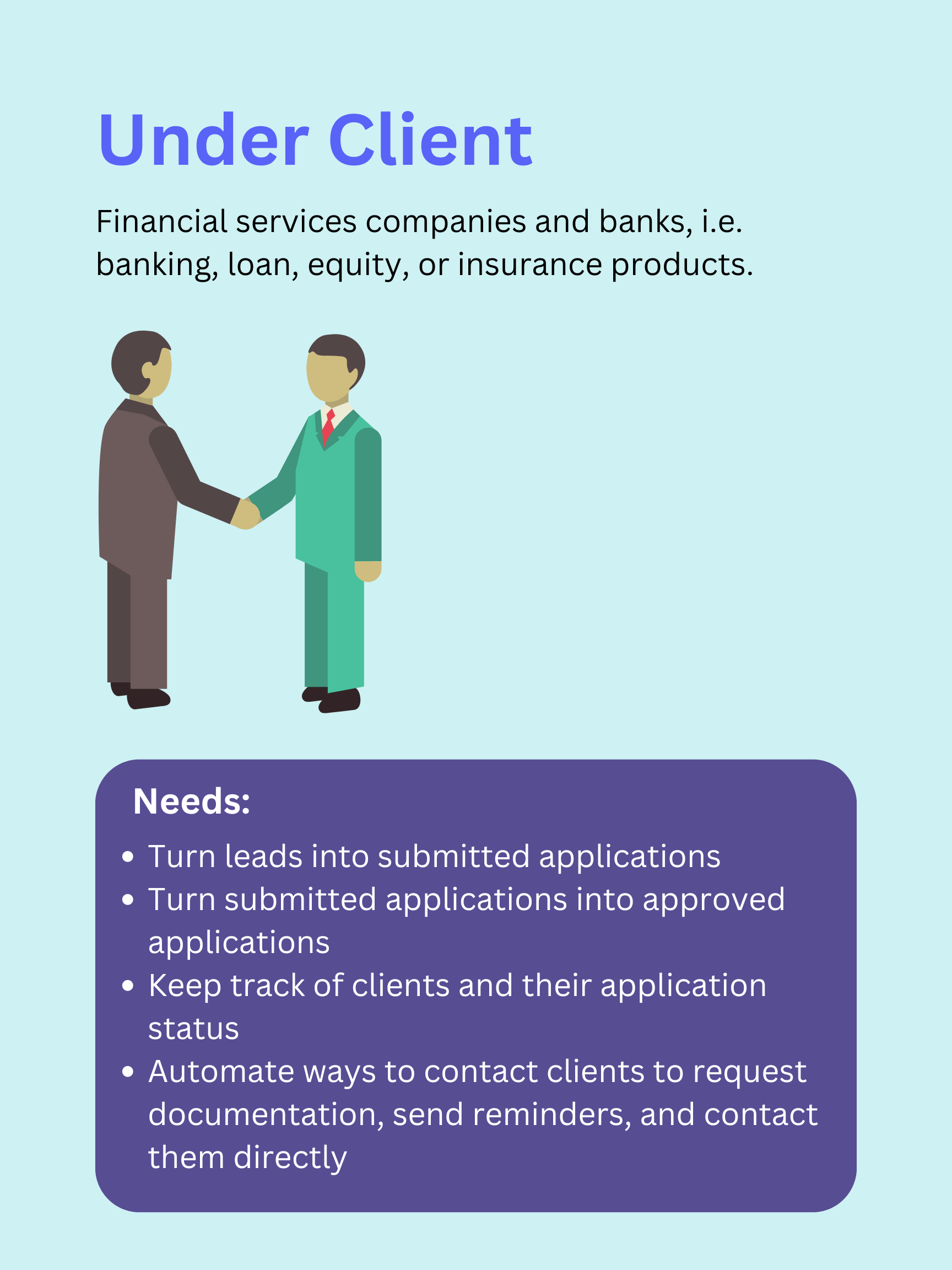
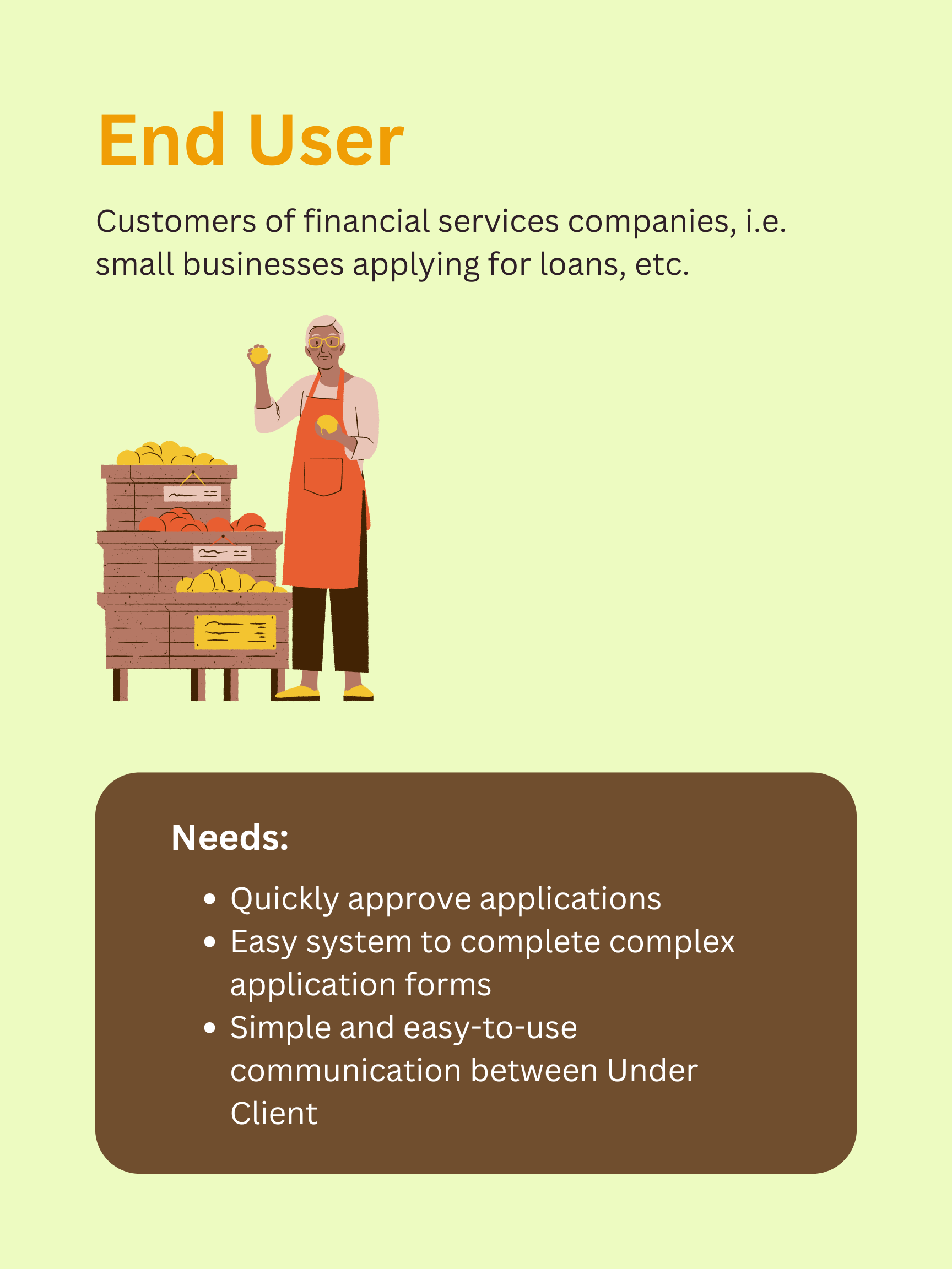
PERSONAS
We developed our findings into personas to help us visualize what we knew about our users.
Design Process
USER STORIES
After getting feedback from stakeholders we decided on three key user stories we wanted to implement into our design solution.
We felt that these were key elements missing from the current communication system that would greatly impact the Under Client's ability to communicate effectively with the End User.
1. As an Under Client (UC) I would like to see End User (EU) full name when messaging clients.
- Default = First Name + Last Name + Phone Number
- IF that data is missing = Phone Number only
2. As a UC I would like my messages to EU to default to being sent as text messages.
- Checkbox for send by email as well
3. As a UC I would like quick actions to insert current applications or document request URL.
- Request data through current applications
- Request documents
DEFINING A MINIMUM VIABLE PRODUCT
We decided to create one high-fidelity screen of the communications to get initial buy-in.
Now that we understood more about the problem space we met with the team and stakeholders to define what our MVP should look like. Not having a current communication platform, Under stakeholders wanted a simple “IM style” design that would be familiar to users that they could test and build off of. We decided to focus on presenting the initial feature in detail with proposed interactions to get initial support that we could build upon later.
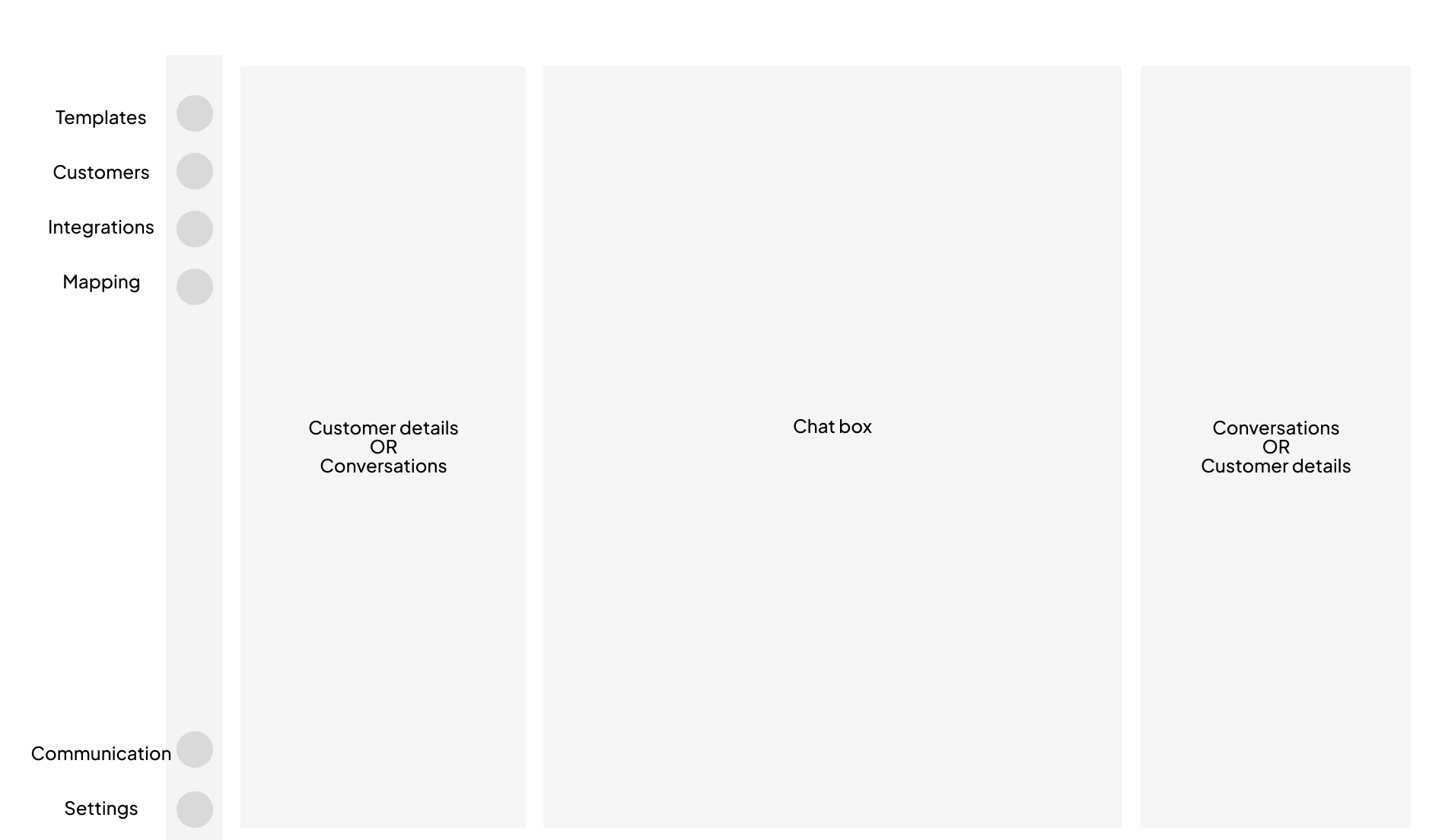
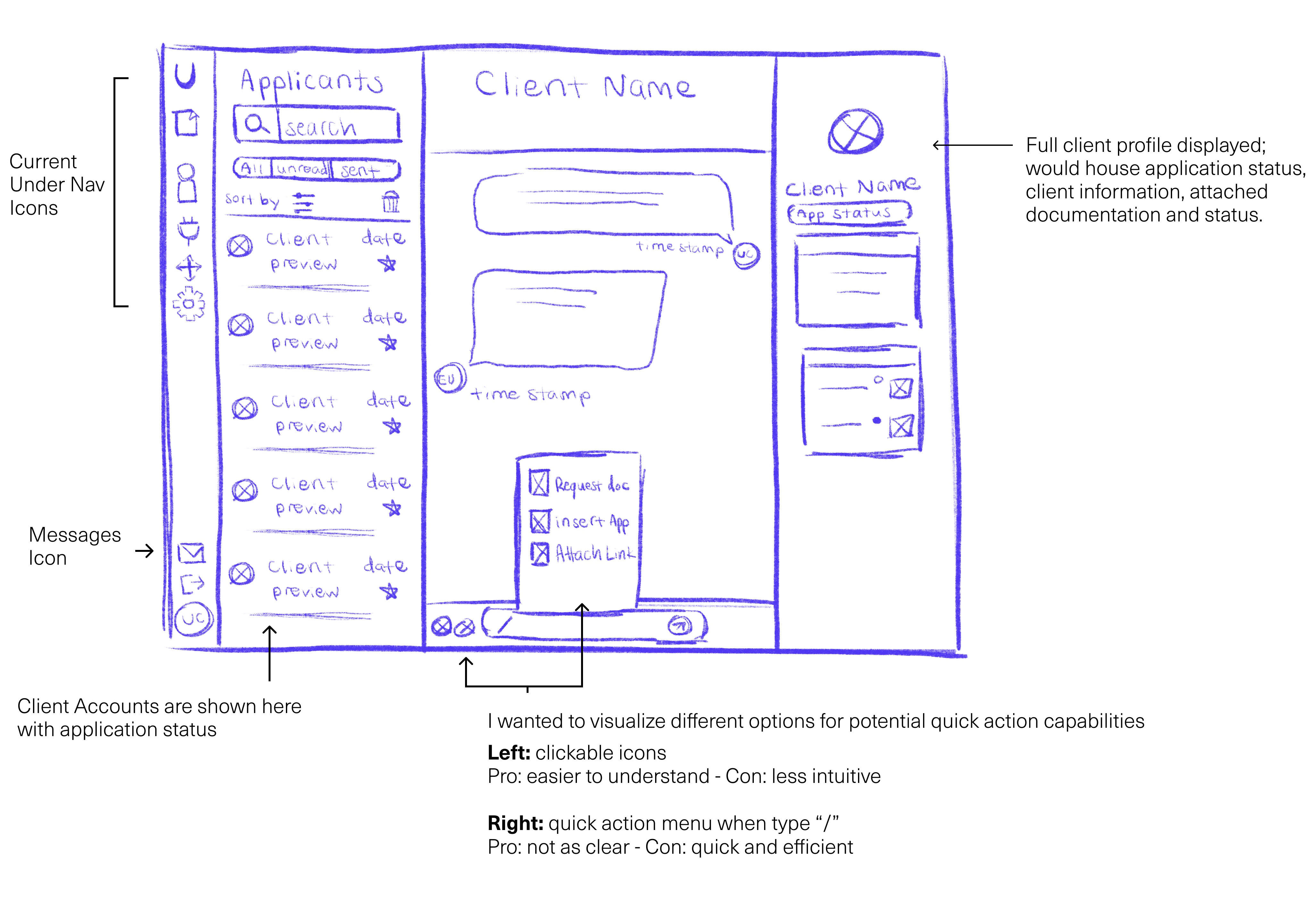
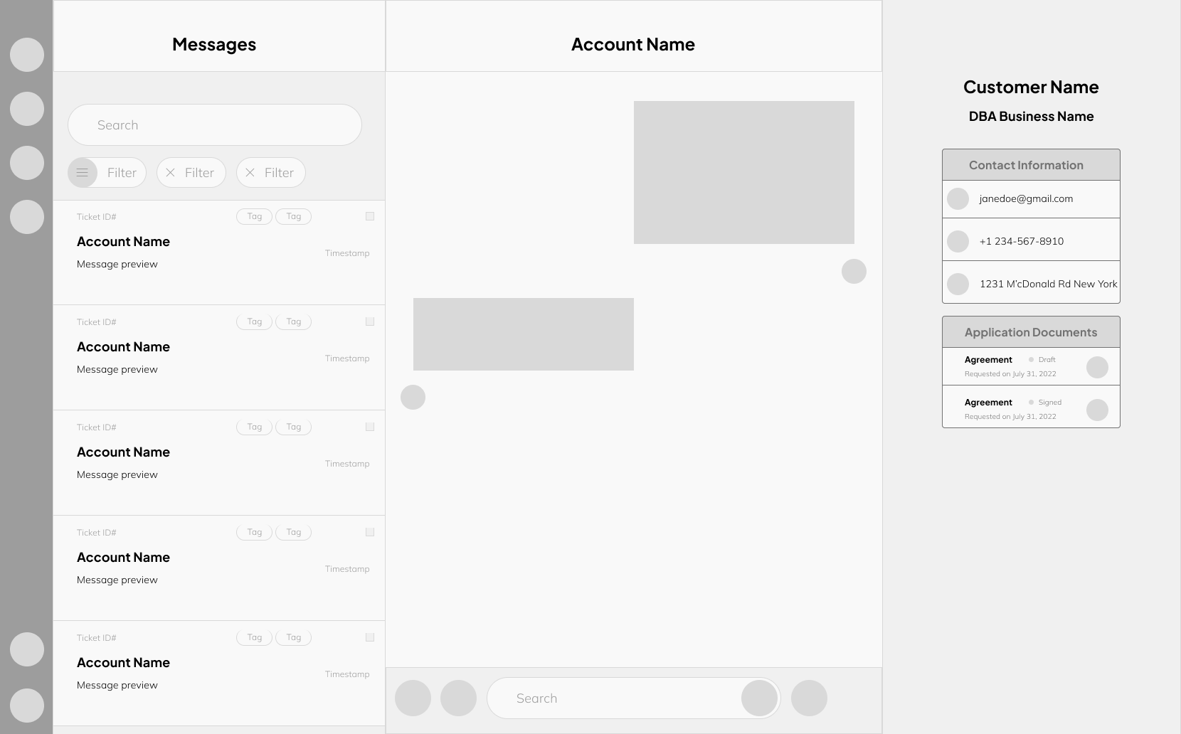
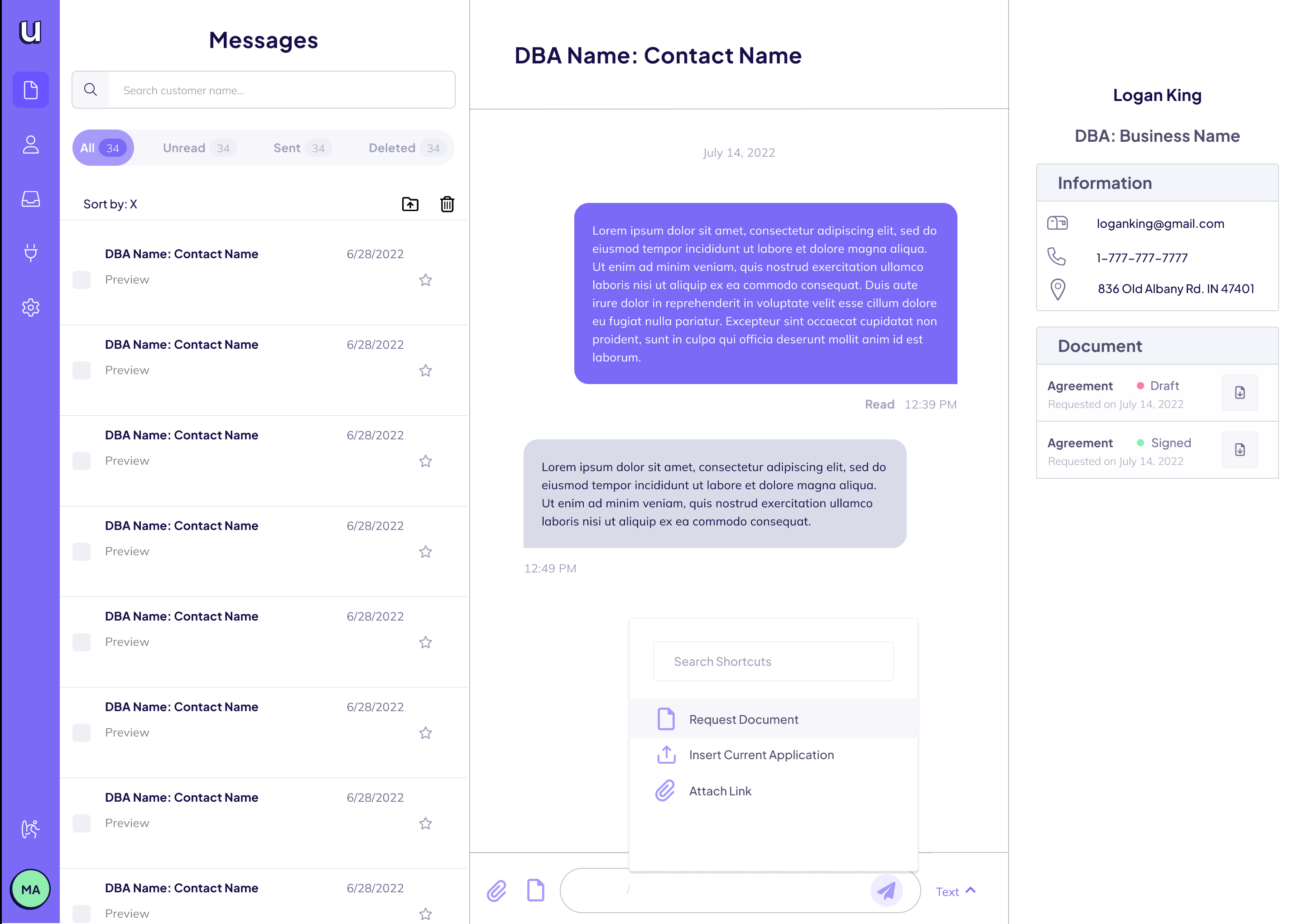
We decided on a three-panel layout that followed design patterns similar to Airbnb’s messaging feature.
Before sketching ideations we looked at different other messaging platforms and found a direction by isolating a layout format that we agreed that we didn't need to reinvent the wheel and it would best suit the business needs.
Concept
Ticket System
Ticketing system that allows Under Clients to sort through End User's tickets and contact clients directly.
Quick Actions
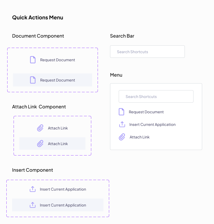
Either icons or a quick action menu next to the search bar so users can streamline the automation of requests for clients or sending them documents, etc.
Application Status
Identifies application status using a ticketing system with filter tags and displays client information in the panel.
Wireframes
High-Fidelity Mockups
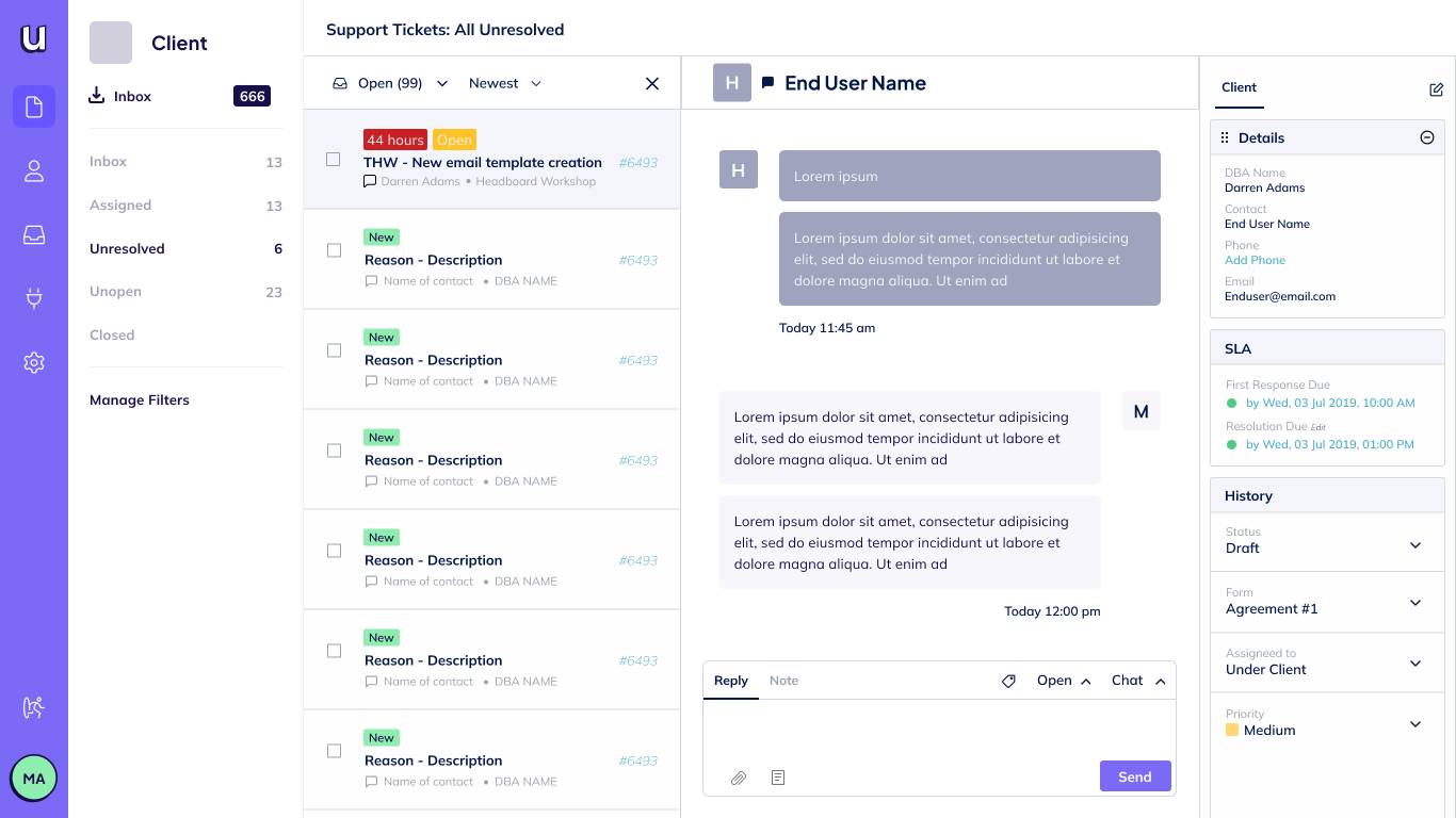
We created several different mockups with different stylizations to get an idea of what kind of direction we would like to go in.
FEEDBACK
After presenting our designs to stakeholders and the Design Lead, we decided to go with a bit more stripped-down version of the mockups that stayed within Under's Design System.
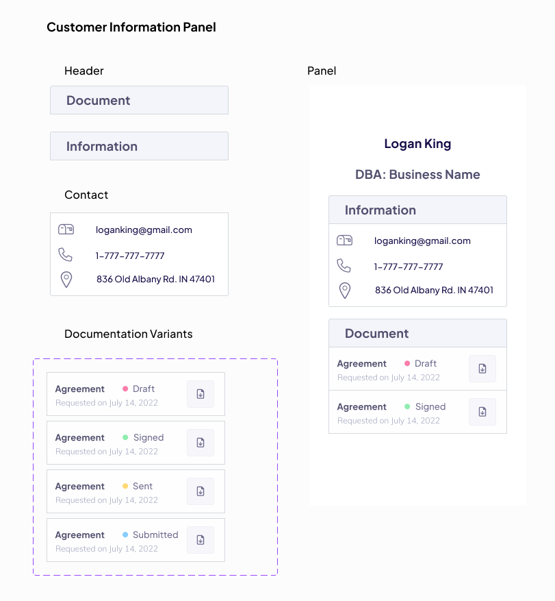
UI Components and Interaction Design
Working within Under’s current existing site styles I designed components and variants for the layout panel and the quick actions menu.
Final Design
After we individually completed our components and panels we worked together to build each panel together into one final screen that we could present to stakeholders as our final MVP that concentrated on creating a seamless messaging experience with a focus on the core pain points being linked to specific documentation and channel of communication.
Presenting our findings and next steps
We presented our final design to stakeholders who were really excited about what we had created. They approved our designs and we have since included our design in their design system.
Had we had the time I would have liked to test our designs with users. However, now that we had a place to start with our MVP next steps for the company are to test the feature with users and continue iterating before their V.2 beta launch.
